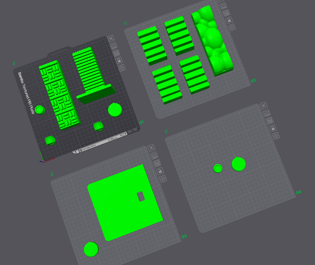
Viva voce briefing on 8 April. Understanding the format and expectations of the final verbal examination, what it's asking for and how to prepare. Made a 3D class mockup alongside this, which is part of the broader 3D file preparation.
The main focus this week was visual design and typeface work. The diagnosis was clear: the typeface has too much character. The project itself already carries a lot of personality, the controller, the materiality, the research context. The type needs to hold that, not compete with it.
WEEK 13
8 April Briefing
Viva voce briefing attended. 3D class mockup made as part of broader fabrication preparation.
Simplify - Stop Over-designing
Consultation with Vikas: side text only useful for different subtitles. The typeface was doing too much. Simplify to let the project speak.
Talked to Vikas on 10 April about the typeface direction. The feedback was direct: side text is only useful for different subtitles. Stop over-designing the type. The project already has enough personality in its objects and materials, the identity work should support that, not add another layer on top.
This is the kind of feedback that requires a step back rather than more iteration. Less, not more. The simplification is the work this week.