Week 6 and the making loop is running more smoothly at this point. The semester arc is: prototype, test, compile data, write, finalise. The pressure of the dissertation running alongside everything else is more manageable now that the RtD framing is clear. The making and writing are the same thing, not two parallel processes.
This week I was more focused on writing on my dissertation so I took a step back from the making to set up a documentation process that would capture the messy middle of the making. Because from the consultation there are mentions of how I should make my images clearer on what it is explaining so I was mainly working on that.
WEEK 6
Practitioner Sessions
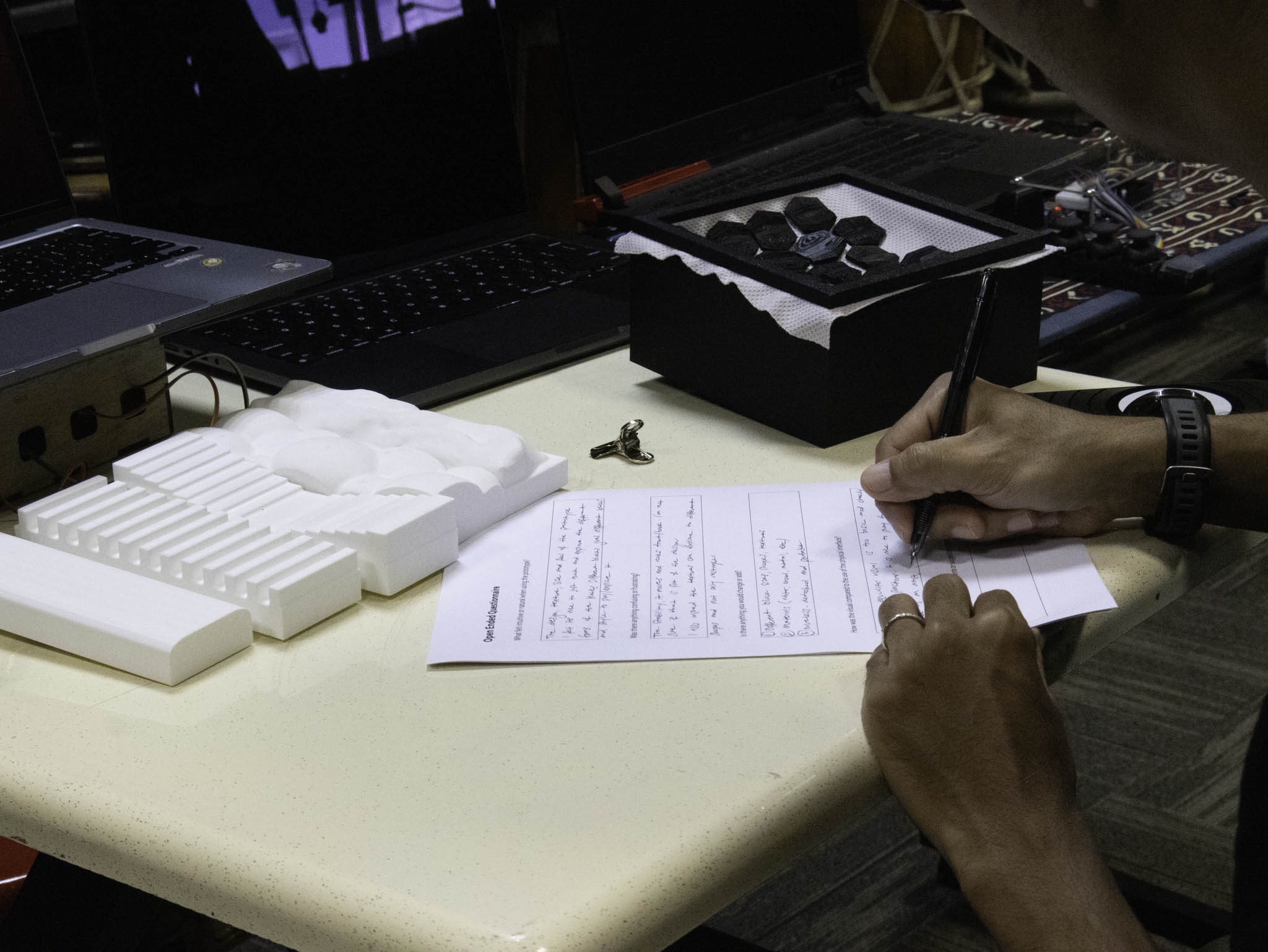
Last user testing with the last practitioner in this week, it was done quite late due to schedulling however the results were interesting!
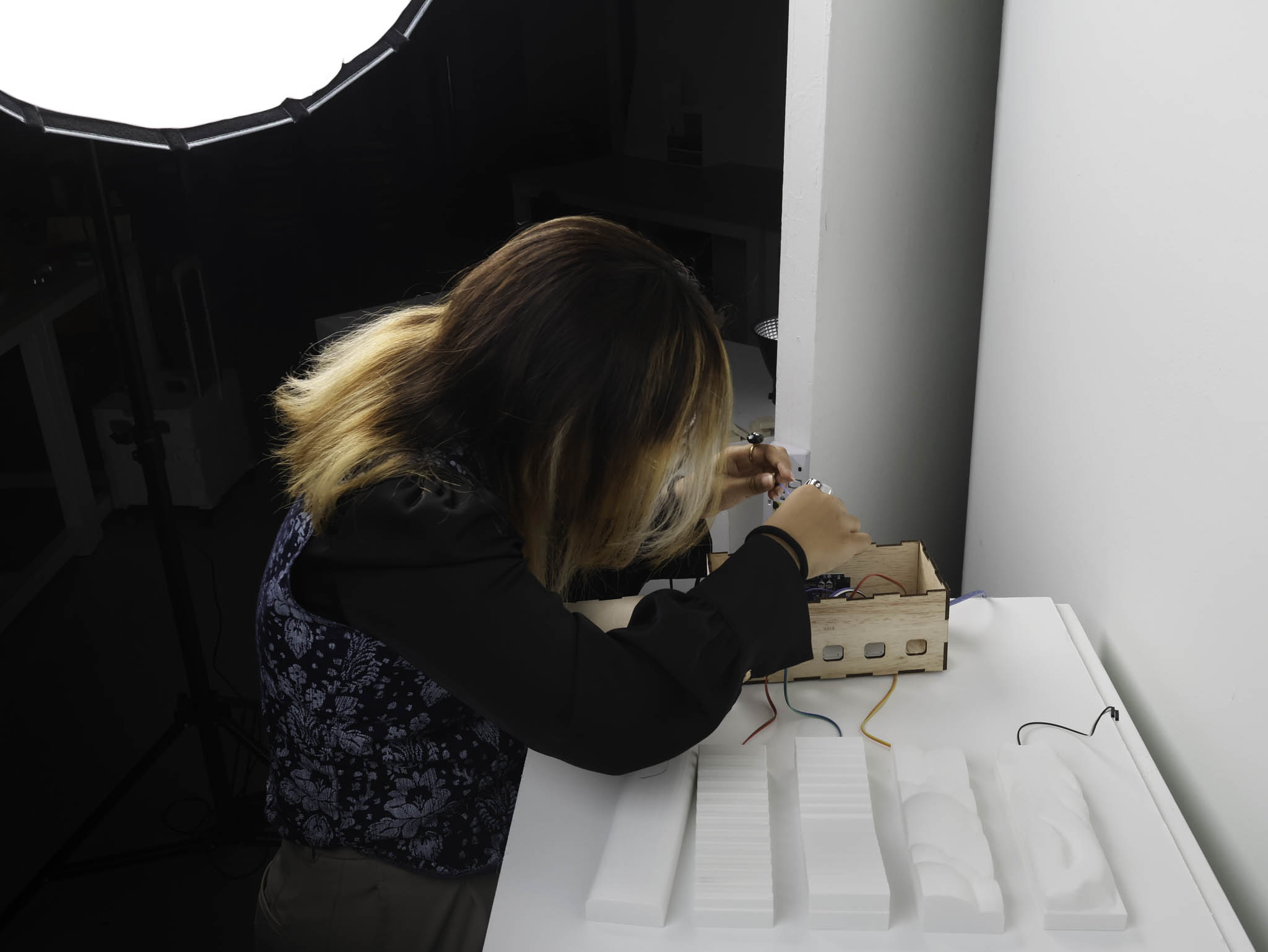
Behind the Scenes
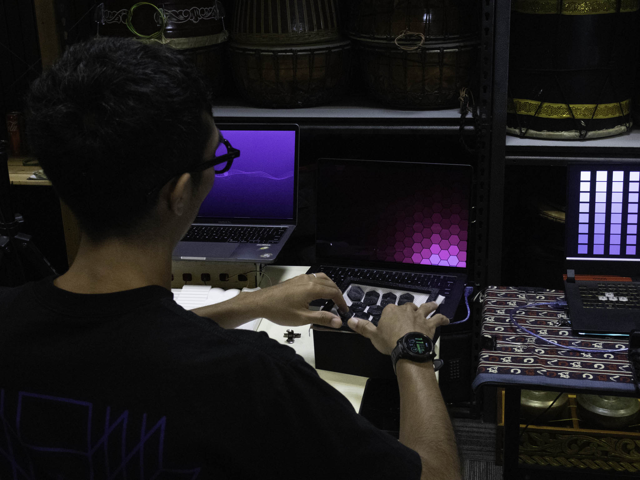
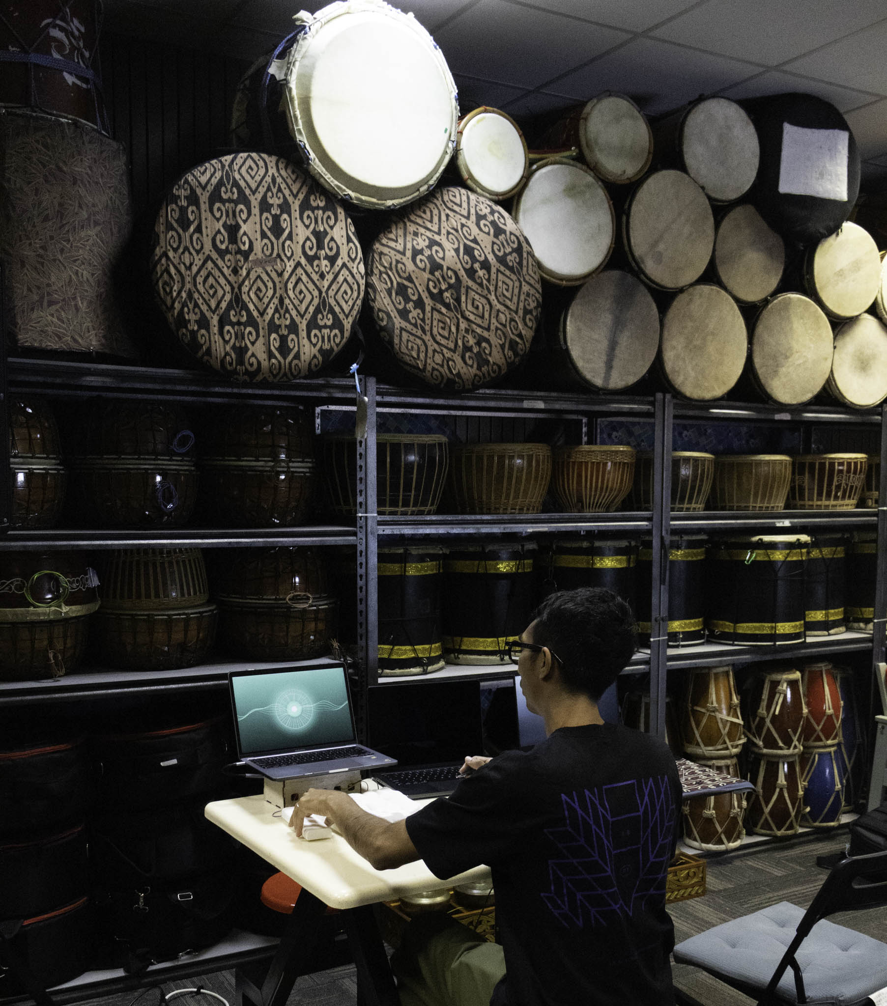
Setting up documentation and BTS process footage.
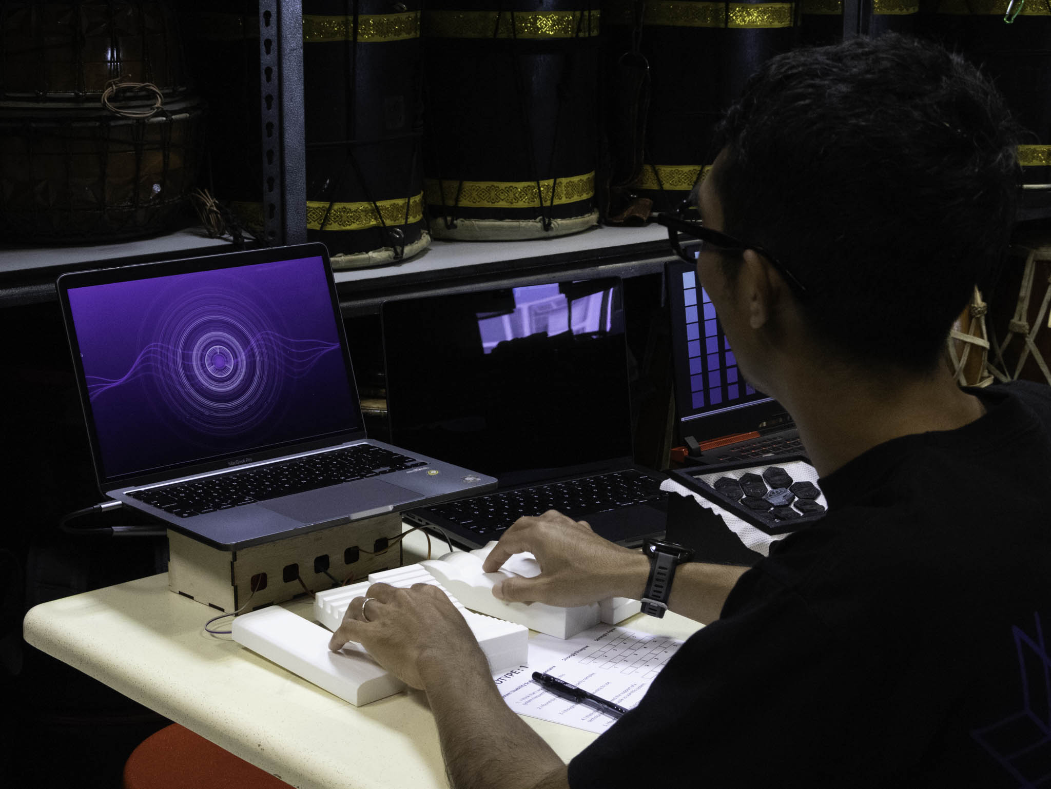
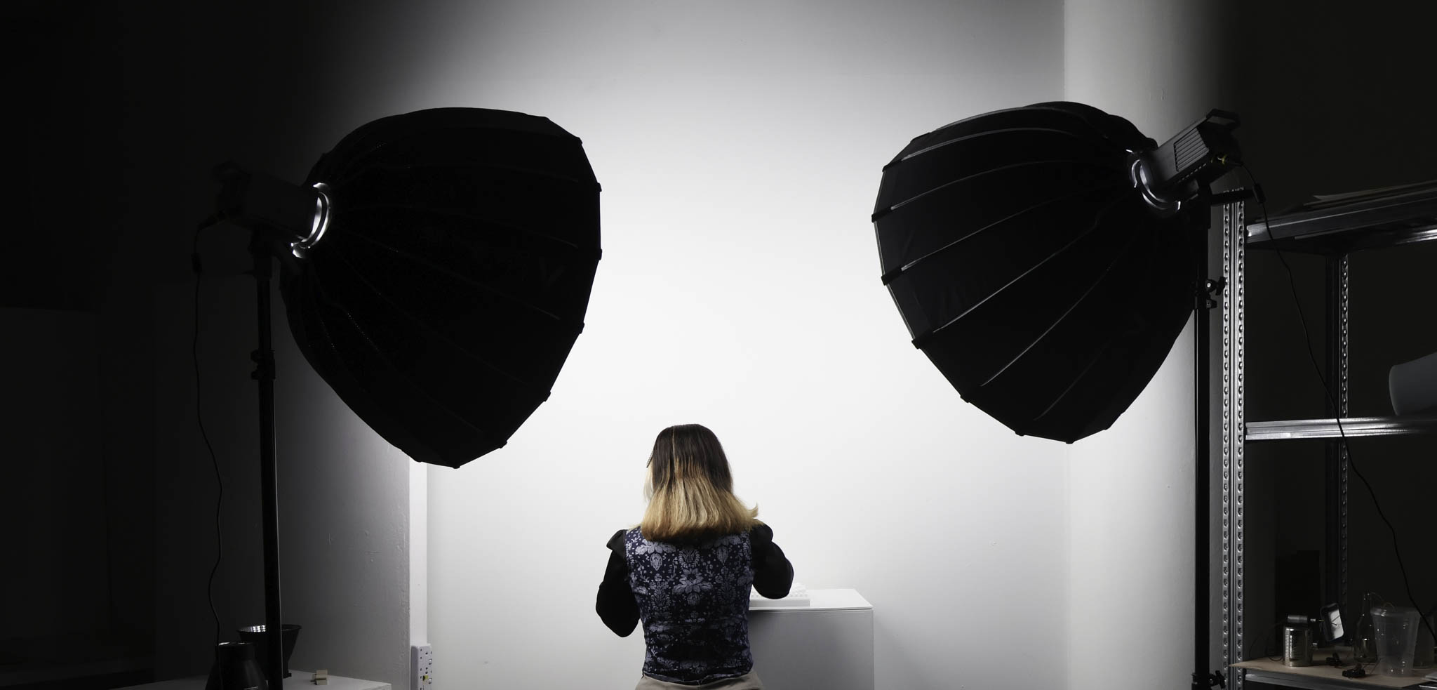
Practitioner user testing this week. These are sessions with people who perform, not just general participants: the tool is being evaluated by the people it's actually designed for. The setup matters here as much as the outcome: how the space is configured, how the testing is framed, what you're asking people to do and observe.
What comes out of these sessions isn't just usability data. It's also information about how the tool positions the performer: whether using it feels like something the performer controls, or something that's happening to them. That distinction is central to the research question.
The gap between making and documenting is still real, but I'm more aware of it now. The CPJ is supposed to capture the messy middle, not just the clean outcomes. Getting better at writing things down before I'm already on to the next thing. (however this is still a work in progress, the gap is still there but I'm more conscious of it and trying to manage it better)
User Testing - SUS Results
With all three rounds of practitioner testing completed, the SUS data gives a clearer picture of how the prototypes were received. Across 10 participants, Prototype 1 averaged 86.5 / 100, Prototype 2 came in at 83, and Prototype 3 at 78.5, all sitting above the generally accepted usability threshold of 68, which puts them in the "good" to "excellent" range. The high scores on Q1 (frequency of use) and Q9 (confidence) across most participants suggest the tool felt approachable even to people who hadn't used something like it before. The lower scores tend to cluster around Q4 (need for technical support) and Q6 (inconsistency), which makes sense: the electronics were still exposed on the breadboard stage, and there were moments where sensor sensitivity wasn't consistent between sessions. What the scores don't fully capture is the qualitative feedback, several participants noted that once they understood the mapping between pressure and visual response, the interaction started to feel more like playing an instrument than operating a device. That distinction is exactly what the research is trying to make legible.
| Participant | Q1 | Q2 | Q3 | Q4 | Q5 | Q6 | Q7 | Q8 | Q9 | Q10 | SUS Score |
|---|